

THROUGH A HINGE MADE OBLIQUE
Nat Power’s and Tsz Kam’s Recent Exhibition
Photos and Interview by Hayley Labrum Morrison
concept animals met with Tsz Kam in our early days and discussed Luxury, Beauty, and the Kraft to Androgyny. As a natural progression beyond those topics, Tsz and their creative partner Nat Power (together they are Big Chicken and Baby Bird) developed a new body of work titled “Through a Hinge Made Oblique”. I sat down with Tsz to learn more about the playfully patterned and pigmented imagery that currently punctuates the walls of Ivester Contemporary in Austin, TX.
A new fantastical mythology is constructed in Tsz and Nat’s work that simultaneously plays on sexual attraction and a disturbing repulsion, all wrapped in flashy fluorescents. In their words, “(Our) collaborative work centers around the experience of shifting between girlhood and womanhood within the ambiguity of gender."

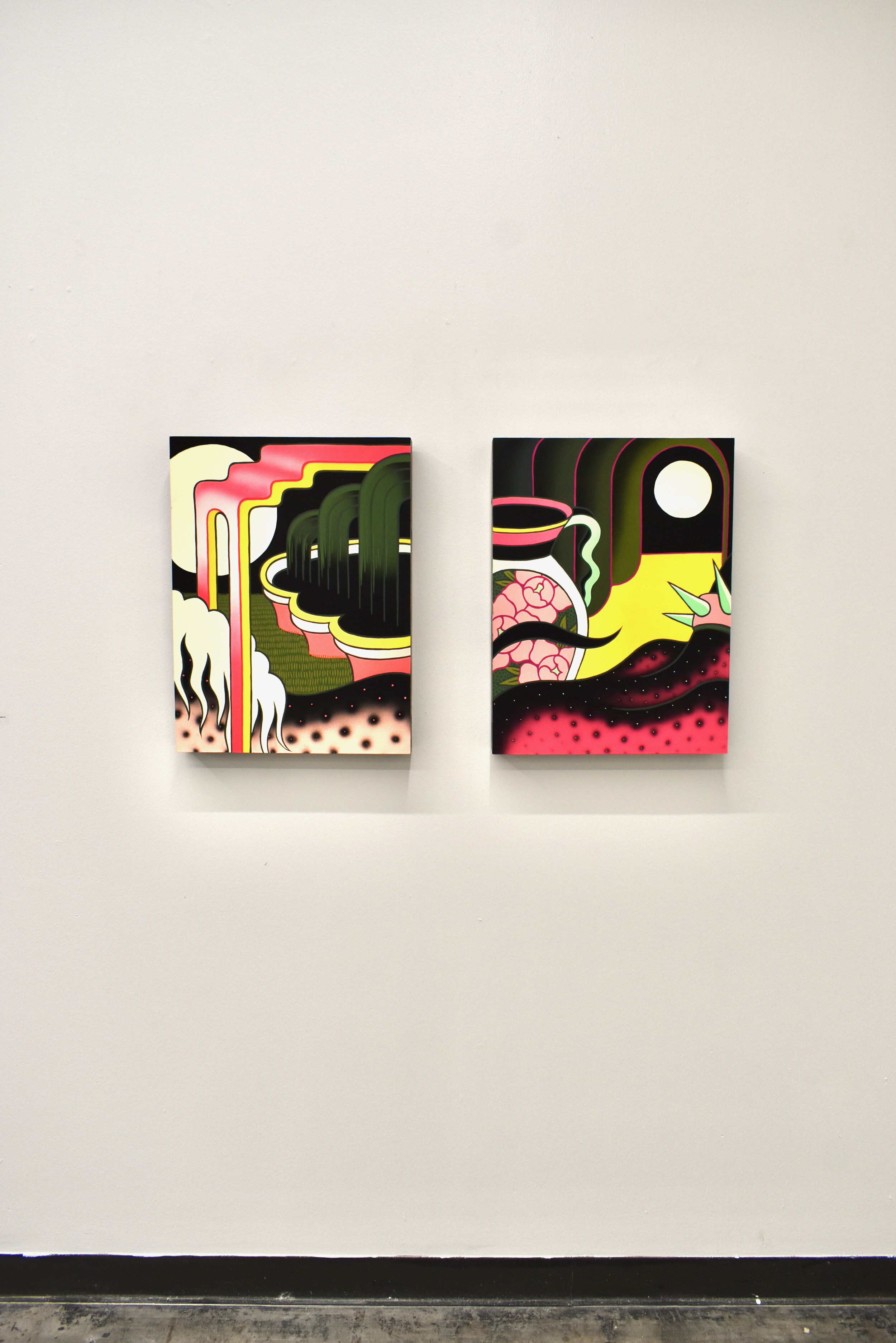
Gush, Tsz Kam, 2021, Acrylic on Cotton Rag Mounted on Panel, 24 x 18” & Library, Tsz Kam, 2021, Acrylic on Cotton Rag Mounted on Panel, 30 x 24”
Hayley Labrum Morrison (HLM): What's new or different about this recent body of work? Did you experiment in any new ways stylistically or conceptually?
Tsz Kam (TK): Stylistically, Nat has begun to incorporate airbrushing techniques, she has used it in her personal pieces as well as the collaborative pieces. She has also made some pieces that are more like snapshots or snippets of larger compositions. I think those are really fun in relation to the larger pieces that feature more complete and symmetrical compositions. They show off the contrast between her brush work and the velvety textures that she’s able to create with an airbrush. I think they also offer a more voyeuristic experience. Nat has been very influenced by her tattoo practice in the past year. There are a lot of visual cues from tattooing that she’s translating into painting. I am also, in turn, fascinated by the richness of the mixing of high and low-brow art. I’ve allowed myself to indulge in the decorative more, using more pattern designs and less focused on making sure that every element in the painting has to serve a particularly deep purpose. We both switched from painting on a loose/soft canvas surface to wood panels with thick edges. I’ve started to paint the left and right edges of my panels with decorative patterns. While Nat stayed with a limited color palette, I have started to get more control over color mixing involving fluorescent pigments.
Conceptually, we are both still interested in the same themes we have explored in the past: gender identity, queer identity, fantasy, and beauty. In this new body of work, we have decided to focus our research on Italian Renaissance grotesque art and the use of decorative patterns as means of transportation to a fantastical realm.
Entrance and Exit, Nat Power, 2021, Acrylic on Cotton Rag Mounted on Panel, 24 x 18” each
HLM: Can you talk more about fantasy and the grotesque in your work? How have these elements come to be apt portrayals of queerness?
TK: The grotesque in art history has always been defined against the classical. It’s also often used as decoration in the margins of manuscripts or other art objects. It quite literally is the marginalized as well as acting as the boundary that classical beauty is defined against. Some argue that the monstrous is not natural while others believe nature also creates “malformed” beings, whether physically or “morally”. As queer people we’re considered morally deficient in Western culture. It begs the question of whether the “monstrous” is just a product of human imagination or nature’s way of making art. Many queer creators before us have reclaimed the image of the monstrous as something empowering rather than demeaning. A popular example from recent times is Lady Gaga’s album, The Fame Monster.
I believe this question of whether the grotesque is natural or imagined relates to the debate of whether queerness is congenital or acquired. I think the boundary has become blurred in the past decade as queer people gain more visibility and society begins to understand more about the queer experience. However, queerness continues to exist as a boundary creature–without a boundary to define it, it cannot exist; without what is considered classical, there is no grotesque. Society is only beginning to understand gender as a more fluid concept, however, for better or worse, we still use labels to define our identities. It is important to note that though boundaries can be limiting, it can also help define what is possible.

Tsz Kam, Library, 2021, Acrylic on Cotton Rag Mounted on Panel, 30 x 24”
HLM: How has the digital world impacted queerness and perceptions of it?
TK: Queer identity requires a lot of imagination. It requires one to imagine a definition of self against conventional expectations. Last year, I watched the Netflix documentary, Disclosure: Trans Lives on Screen, in which the interviewed transgender writers and actors mentioned how negative and stereotypical portrayals of “men in drag” on TV expanded their childhood imagination of who they could become. They discussed how although these portrayals were meant to make fun of trans women, it showed them a visual possibility. In some sense, these early stereotypical depictions of trans women were meant as grotesque portrayals to elicit laughs from the audience. These characters were from the imagination but have informed real world queer folks and their reality, in which the negative portrayals are reclaimed and appropriated into something authentic and empowering.
Nat and I both grew up on the Internet. We played house on the Internet and we learned about the experience of others outside of our limited childhood bubbles through various online spaces. As adolescents, we were both intensely interested in fanart, furry art, and other adjacent creative works created by our peers on the Internet. These are all exercises of make-believe, which is a strong element in building one’s own identity. It allows us to project ourselves in art. It’s a practice of saying, this is what I can create, the kind of relationships I can imagine myself having, and who I can become.

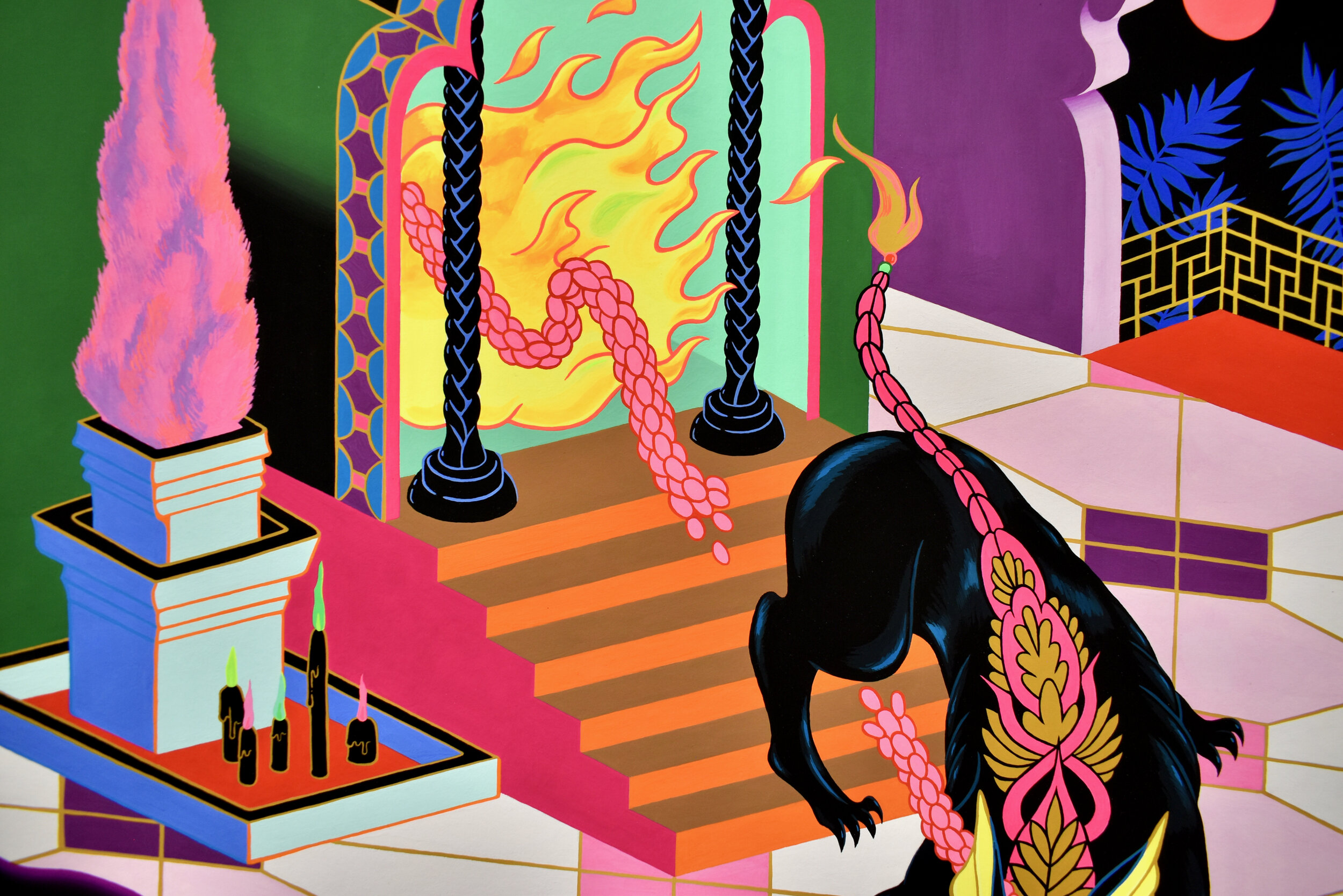
Lionfish and Stallion, Big Chicken & Baby Bird, Acrylic on Cotton Rag Mounted on Panel, 35 x 24” each
HLM: Why is it important for your work to be visually attractive while portraying strange and unusual subjects and environments?
TK: I think part of the attractiveness of the work comes from the use of fluorescent colors, which reflects more light than normal colors. It’s usually pretty hard for your eyes not to be immediately attracted to them, that’s why they are used for traffic cones and other safety gears!
I would describe the unusual subjects and environments in our imagery as surrealist in nature. Surrealism is about connecting the unconscious or dream state with the real world. The original surrealists claimed that reality is absurd and therefore surreal. It’s a response to the confusion and chaos post-World War I. I think reality has only become more surreal since then. The environments depicted in our paintings are references to the spaces we grew up in: for Nat, it is the suburban mall architecture and her family’s unusual interior design choices; for me, it is the nightclub my parents worked at in Hong Kong and the superstitious religious culture ingrained deeply in that city’s DNA.
As I’ve said before, the virtual and the fantastical inform our imagination, which in turn inform what we do in the real world. We use fluorescent colors that resemble digital colors on a screen, essentially making virtual colors real. We aren’t using art as an ambivalent commentary on the digital age, the point of our work has always been more about the blurred boundary between what is considered real and what isn’t. The way we use colors is an example of the breakdown between those two realms. I do find it poetic that fluorescent colors cannot be accurately photographed, and therefore cannot be accurately depicted digitally. We’ve pulled something out from the virtual world, and we’ve made it impossible for it to return. There is some commentary on the idea of Pandora’s box in there somewhere.
There is also some perverseness in making visually attractive paintings, we want to draw you in and we don’t want you to look away. It’s a seduction play. Painting was declared dead long before both of our times, and in the age of attention economics, it feels even harder to create works that will hold attention. Using neon colors might be a cheap shot, but ultimately, we just want you to look and let us kidnap your mind for a minute to our otherworldly place.

Horned Fountain, Nat Power, 2021, Acrylic on Cotton Rag Mounted on Panel, 30 x 24”
HLM: How closely did you work with each other throughout the creation of the paintings?
TK: The first stage of our collaborative process involves both of us sitting side by side and working on rough sketches that will be passed back and forth and drawn over by each other. We’d then clean up a final draft and decide on how things should look (like, is some anatomy coming out from a certain angle? Or is it just supposed to be some impossible visual illusion?). As a tattoo artist who has to sketch out flashes daily, Nat is the more practiced draftsman, so we often rely on her to create a stylized anatomical look, while I am less bound by a visual discipline and tend to create the mutated looking forms that I’d let her interpret with her hand. Nat is a master of the limited palette while I have more experience in coming up with a wider range of weird color combos within the same image. She paints fast and efficiently; I paint slow and prefer to do the final touches and cleanups. For the piece, Lionfish, Nat blocked out most of the colors within the same night with me doing all the color mixing on the side. Outside of making collaborative pieces, we also give each other freedom to trade imagery on the regular. It’s a visual conversation, which is very fun and one I am very grateful to have in my life. It isn’t hard for us to stay conceptually on the same page, since we are more or less interested in the same topics, and are very willing to expand on our own understanding based on the other’s.

Tsz Kam and Nat Power at Their Opening Reception, July 2021
HLM: Are there any specific pieces that you feel strongly about? Can you tell us more about them?
TK: For my work, I feel strongly about She and Sonata. The sphinx has a grandness to it that I am attracted to. I also really love the patterns on the side of that piece. I used a neon teal color in Sonata that I feel a strong attraction towards, the way it was used against darker colors makes it look almost like moonlight. It vibrates and soothes at the same time when I look at it in person. That’s why I named the painting Sonata. It’s hard to pick one from the collaborative pieces, but I think Herd is my favorite one because it looks like a nicely arranged sushi platter to me. I think there is some message about anti-animal cruelty in there. I liked Nat’s Atrium the moment I saw the sketch. The fountain looks very ambitious with a structure that looks like a layer cake. The receding perspective created by the tile lines on the ground is also very effective in communicating how large the space is. Nat’s favorite of her own is Guard Dog, and is most pleased with the collaborative outcome of Lionfish; figuring out the anatomy and color palette there was very much like a puzzle we solved together.

Atrium, Nat Power, 2021, Acrylic on Cotton Rag Mounted on Panel, 36 x 24”
HLM: "Lionfish" has got to be one of my favorites. The combinations of styles and the confusion of where the creature ends and begins is fascinating. Can you tell us more about this piece?
TK: We love that piece too. We described the color palette as very Barbie-like when we were working on it. There was a piece of an eyeless lion that I painted in April. Nat was very into the way I did the eyeless lion and wanted to use it in a collaborative piece, so we did and made him a mer-lion. I was looking at some baroque paintings where bodies are piled on top of each other and drew a very rough and confusing sketch of these disembodied animal parts twisted together. Nat took over and I described to her verbally what I was seeing, she then came up with the viper and the brillant looping tails that defy physics.
There is a story behind the purple we used for the part of the mer-lion that’s submerged underwater. We often listen to horror stories and weird fiction podcasts when we work on our paintings. We were listening to a story from The Drabblecast that was a homage to Lovecraft style horror. The story is called “The Wall Paper out of Space” by Adam-Troy Castro. Castro described the color of this wallpaper in the story as “The pigment coming from some meteor that fell into a swamp” and how it brings indescribable cosmic horror to the character. I already had this purple color mixed for the purple I used in Escape, and to be honest, purple is just purple, I can’t mix you a purple that will bring you cosmic horror. But colors are also relative, meaning what color you place next to another can change the way a color feels, so we came up with the idea of airbrushing the purple on top of the muddy gold, and I think that’s what made this purple so decidedly weird.

Lionfish, Big Chicken & Baby Bird, 2021, Acrylic on Cotton Rag Mounted on Panel, 35 x 24”
Through a Hinge Made Oblique
SHOW STATEMENT
Through a Hinge Made Oblique explores ideas of blurred boundaries and futility of containment by depicting the grotesque as the embodiment of the conflict between art and nature. Patterns become the spells that open fictive portals through which the grotesque is observed, confined to and defined against the beauty of an imagined world, where they can be works of nature, works of art, or both at the same time.
Having grown up in the 90s, Kam and Power are inspired by the digital colors that exist exclusively in the virtual space of the Internet. Using fluorescent pigments, Kam and Power replicate the palette of Microsoft Paint and create surrealist images that reference visual themes of the online spaces that influenced their childhoods. The fluorescent glow from such color choices impregnates their paintings with an ethereal presence that can only be perceived and experienced in real time. Since fluorescent pigments cannot be accurately photographed by a digital device, these paintings cannot be translated back into the digital virtual space that inspired them. By irreversibly extracting virtuality into reality, Kam and Power situate their paintings as objects of reality rather than simply signifiers of the virtual space they hail from. Using the grotesque as a metaphor for the conflict between art and nature, and the debate of queer identity as congenital or acquired, Kam and Power’s paintings put on display the blurred boundary between the virtual and the real, and the proof of a containment breach. begins with an idea. Maybe you want to launch a business. Maybe you want to turn a hobby into something more. Or maybe you have a creative project to share with the world. Whatever it is, the way you tell your story online can make all the difference.
— Big Chicken & Baby Bird